::before ::after
Some examples of the ::before and ::after pseudo elements
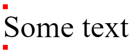
<p class="e1">Some text</p>
.e1::before {
content: '';
display: block;
background: red;
width: 10px;
height: 10px;
}
.e1::after {
content: '';
display: block;
background: red;
width: 10px;
height: 10px;
}
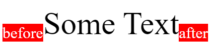
<p class="e2">Some Text</p>
.e2::before {
content: 'before';
background: red;
font-size: 2rem;
vertical-align: bottom;
color: white;
}
.e2::after {
content: 'after';
background: red;
font-size: 2rem;
vertical-align: bottom;
color: white;
}
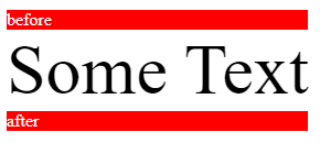
<p class="e3">Some Text</p>
.e3 {
display: inline-block;
}
.e3::before {
content: 'before';
background: red;
font-size: 1rem;
display: block;
color: white;
}
.e3::after {
content: 'after';
background: red;
font-size: 1rem;
display: block;
color: white;
}
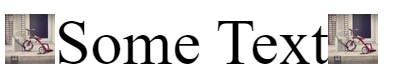
<p class="e4">Some Text</p>
.e4::before {
content: url(https://unsplash.it/50/50);
}
.e4::after {
content: url(https://unsplash.it/50/50);
}
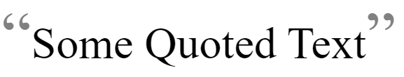
<p class="e5">Some Quoted Text</p>
.e5::before {
content: open-quote;
font-size: 1.5em;
color: grey;
}
.e5::after {
content: close-quote;
font-size: 1.5em;
color: grey;
}
Tooltip
Some Link Text<a class="e6" href="#" data-tooltip="some tool tip text">Some Link Text</a>
.e6 {
position: relative;
}
.e6::after {
content: attr(data-tooltip);
display: block;
position: absolute;
background: rgba(0, 0, 0, .8);
padding: 1rem 3rem;
border-radius: 15px;
color: white;
white-space: nowrap;
bottom: 100%;
left: 0;
opacity: 0;
transition: opacity .2s ease-out;
}
.e6:hover::after {
opacity: 1;
}
List styling
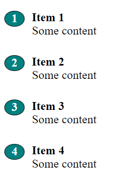
<div class="e7">
<h2>Item 1</h2><p>Some content</p>
<h2>Item 2</h2><p>Some content</p>
<h2>Item 3</h2><p>Some content</p>
<h2>Item 4</h2><p>Some content</p>
</div>
.e7 > h2 {
margin: 1.5em 0px 0px 0px;
}
.e7 > p {
font-size: 1.5rem;
margin: 0px 0px 20px 0px;
}
.e7 {
position: relative;
counter-reset: counter;
margin: 0px 0px 0px 2em;
padding: 0px 0px 0px 2em;
}
.e7 > h2::before {
content: counter(counter);
counter-increment: counter;
position: absolute;
left: -1em;
background: teal;
padding: 0.2em 0.4em;
border-radius: 50%;
color: white;
width: 20px;
height: 20px;
display: flex;
justify-content: center;
align-items: center;
border: 1px solid black;
}
You can add list styling to non-list items.
Text placeholder
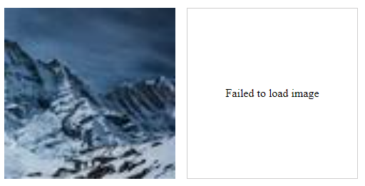
<div class="flex">
<img class="e8" src="https://unsplash.it/80/80" alt="cat">
<img class="e8" src="#" alt="cat">
</div>
/* Text placeholder */
.e8 {
display: block;
position: relative;
width: 15em;
}
.e8::before {
border: 1px solid hsl(0, 1%, 81%);
display: flex;
content: "Failed to load image";
justify-content: center;
align-items: center;
width: calc(100% - 2px);
height: calc(100% - 2px);
}
.flex {
display: flex;
gap: 1em;
}
content can be used to add placeholder text in case an image can't be loaded, this is similar to the alt attribute text in HTML, but no image missing icon is shown.
Image placeholder

<div class="flex">
<img class="e9" src="https://unsplash.it/80/80" alt="cat">
<img class="e9" src="#" alt="cat">
</div>
/* Image placeholder */
.e9 {
display: block;
position: relative;
width: 15em;
}
.e9::before {
position: absolute;
border: 1px solid hsl(0, 1%, 81%);
background-image: url(placeholder.png);
background-size: contain;
content: '';
inset: 0;
}
If an image can't be loaded, then a ::before pseudo element can be used to load a placeholder image instead.