Flex container
When display flex is declared on a parent element that element becomes a flex container, and all the child elements become flex items.
Display flex has no impact on how the parent element interacts with other elements around it, display flex is an inner display that affects the child elements.
When we declare a display flex the outer value of the parent will be a display block, the parent will behave like a block level element, but on the inside it’s changing the behaviour of the child elements to flex items.
Inline-flex makes the parents behave like an inline element.
Flex items
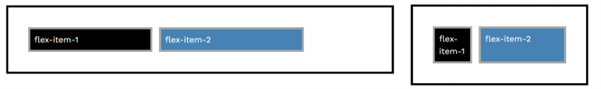
Display flex will overwrite the inline/block display properties child elements, flex takes priority over other display properties, all of the children will be become flex items.
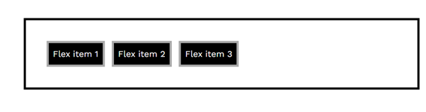
By default, when elements are flex items they will shrink to fit the content inside of them.
If the content is the same, it will make the flex items take up the same amount of space.
Flex box tries to avoid breaking content/causing overflow.
The way elements shrink depend on the size of the content in each flex item.
Flex items have a width of auto by default, they fill the space the way they want to.
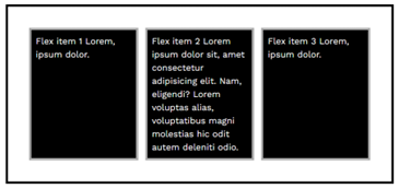
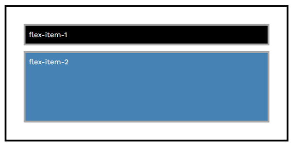
By default, all flex items stretch to match the height of the tallest item.
If you set a small height on a single flex item, then only that one flex item will change in height, the other flex items heights won’t change.
but if you set a large height that’s taller then any of the other flex items, then by default all of the flex items will grow to match that height.
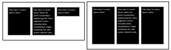
Flex-direction
- flex-direction: row
- flex-direction: column
- flex-direction: row-reverse
- flex-direction: column-reverse
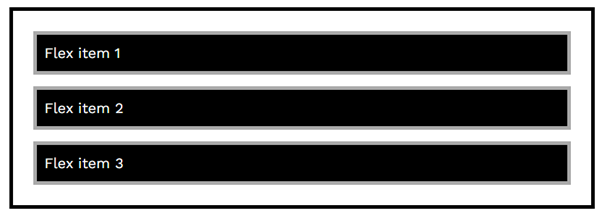
Flex direction lets you set whether the flex items should be displayed as columns or rows.
With display flex, flex item margins won’t overlap.
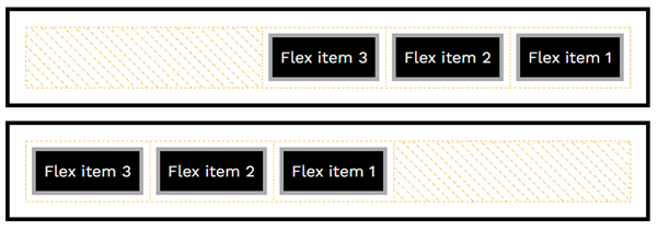
Applying “flex-direction: row-reverse” to a flex item will horizontally reverse the order of the child elements inside of that flex item.
Applying “flex-direction: column-reverse” to a flex item, vertically reverses the order of the child elements inside of a flex item.
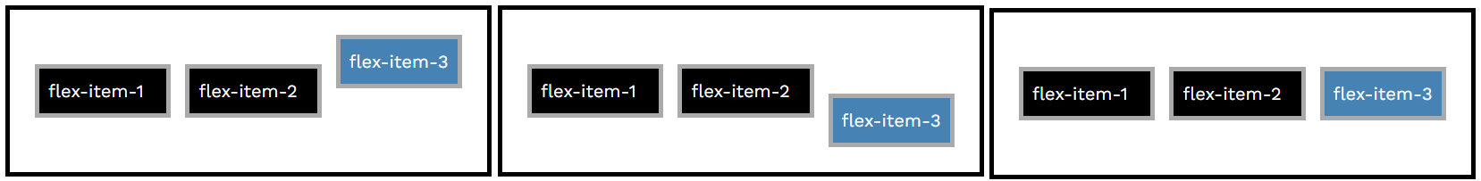
Order
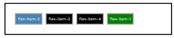
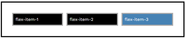
The flexbox “order” property lets you change the order in which flex items are displayed, works a little like z-index, by default every flex item has an order of 0.
For example Setting an items order to -1 will cause it to jump to the beginning of the row (blue box), and setting “order: 1” will cause the flex item to jump to the end of the row (green box).
Flex-grow
- flex-grow: 0
- flex-grow: 1
- flex-grow: 2
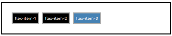
All flex items have a default value of flex-grow 0, this means don’t grow.
If you add “flex-grow: 1” to a single flex item, such as the blue box in this example, then that item will grow to fill the space.
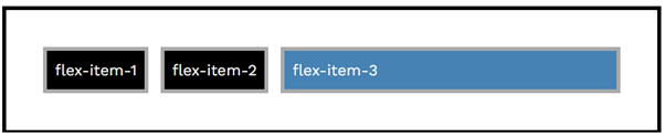
If you add “flex-grow: 1” to all the flex items, then they will all grow evenly to fill the space.
Adding “flex-grow: 2” to the 3rd flex-item and “flex-grow: 1” to all the other flex items, will cause the 3rd item to grow twice as fast as the other items.
Flex-grow can be any positive integer, it acts as a multiplier specifying the speed at which flex-items will grow. All negative numbers will be interpreted as 1, “flex-grow: -5” is the same as “flex-grow: 1”. “Flex-grow 0” disables growing.
Flex-shrink
- flex-shrink: 0
- flex-shrink: 1
- flex-shrink: 2
By default all flex items have “flex-shrink: 1”.
Flex shrink allows flex elements to shrink down. In this example I have set a “width: 300px;” and a “flex-shrink: 0”, disabling flex-shrink with 0, stops the flex items from shrinking causing overflow.
In this example the blue box has a “flex-shrink: 5” causing it to shrink 5 times faster then the other flex items which have a “flex-shrink: 1”.
If you want an element to be a specific width, it’s better to use a “max-width” and “flex-grow:1” combination instead of “width”, as this allows the element to shrink down for small screen sizes, but still remain the fixed width on larger screen sizes.
For example the blue box has a width of 350px “max-width: 350px”, but flex-grow still allows the flex item to be smaller if it needs to be.
Flex-basis
- flex-basis: 200px
- flex-basis: 5em
- flex-basis: 18rem
All flex items have a flex basis of auto by default.
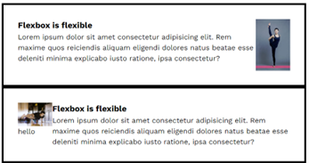
Flex basis can work similar to a width when using “flex-direction: row”, for example the blue square has a “flex-basis: 200px”.
Flex basis is impacted by the flex direction, here the blue flex item has a “flex-basis: 200px” but the parent container has a “flex-direction: column”. When using column, flex basis acts as a height rather than a width, so the flex item now has a height of 200px.
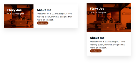
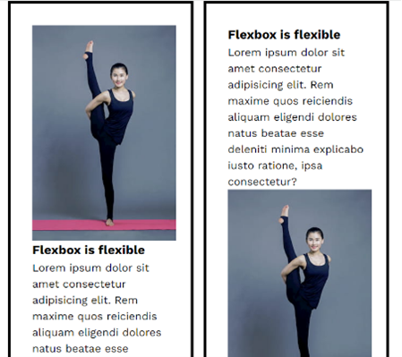
Here is an example of “flex-basis: 18rem” being used to adjust the width/height of the image in this about me card. On large screen sizes the width is 18rem, but on small screens the height is 18rem. This is done just by changing the flex direction.
The image also has a “flex-shrink: 0” to stop it from shrinking less than the “flex-basis: 18rem” when on smaller screen sizes.
Pixels for media queries: For media queries you should always use “em” units, Safari has some strange quirks with “rem”, and pixels should be avoided because users can change their default font-size in their browser settings, which would change when the media query is activated.
Justify-content
- justify-content: flex-start
- justify-content: flex-end
- justify-content: center
- justify-content: space-around
- justify-content: space-between
- justify-content: space-evenly
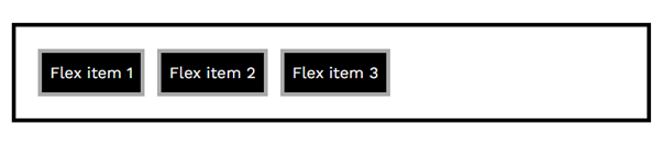
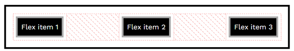
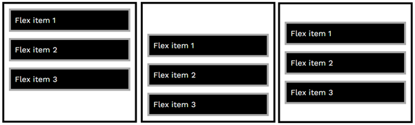
By default, all flex items have “justify-content: flex-start”. Flex-start pushes the flex items to the left
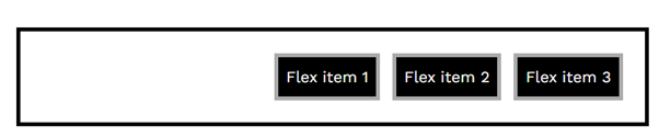
“justify-content: flex-end” pushes the flex items to the right.
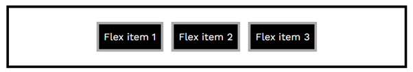
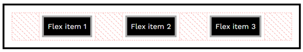
“justify-content: center” centers the flex items
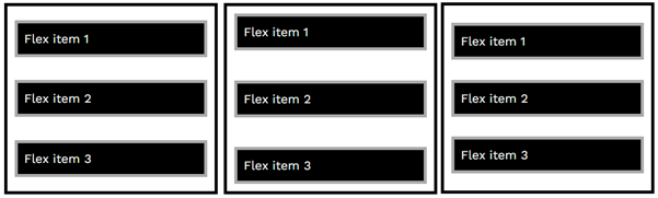
“justify-content: space-around” takes all of the available free space and evenly distributes it around each item.
“justify-content: space-between” evenly distributes the space in between the flex items
“justify-content: space-evenly” is similar to space-around, but the gaps between each flex item and the gaps at the beginning and end of the flex items are exactly the same.
Justify-content
When using “flex-direction: row-reverse” or “flex-direction: column-reverse” the justify content flex-start and flex-end will be swapped. So flex-end will push the flex items to the left, and flex-start will push the items to the right.
If there is no available space at the top of bottom when using “flex-direction: column” then justify-content will have no effect.
“justify-content: flex-start” pushes the flex items to the top of the flex container.
“justify-content: flex-end” push the flex items to the bottom of the flex container.
“justify-content: center” centers the flex items.

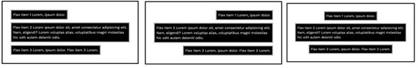
justify-content space-around, space-between, and space-evenly.
justify-content space-around, space-between, and space-evenly.
Align-items
- align-items: stretch
- align-items: flex-start
- align-items: flex-end
- align-items: center
- align-items: baseline
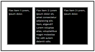
“align-items: stretch” is the default value, stretch will stretch all of the flex items to match the longest siblings height.
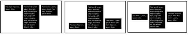
“align-items: flex-start” squishes the flex items to match the height of the content and aligns with the top of the flex container
“align-items: flex-end” squishes the flex items to match the height of the content and aligns with the bottom of the flex container.
“align-items: center” squishes the flex items to match the height of the content and aligns each flex item in the center.
With flex-direction: column, align-items: stretch is the default again.
“align-items: flex-start” squishes the flex items to match the content with and aligns on the left.
“align-items: flex-end” squishes the flex items to match the content width and aligns on the right.
“align-items: center” squishes the flex items to match the content width and aligns in the center.
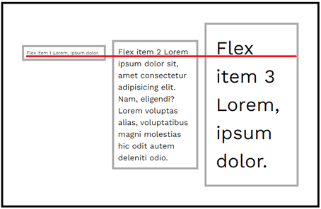
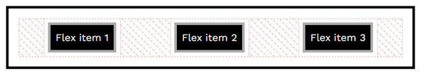
“align-items: baseline” similar to flex-start, but the flex items are aligned based on the bottom of the first row of text, as indicated by the red line.
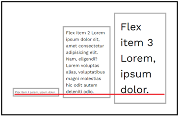
“align-items: last baseline” similar to flex-end, but the flex items are aligned based on the bottom of the last row of text, as indicated by the red line.
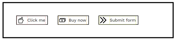
You can use “display: inline-flex” to align buttons next to each other, to align the text in the center button next to the image, you can then use “align-items: center”.
Flexbox navbar
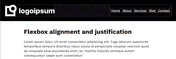
To create this navbar, the parent flex container has a “display: flex”.
“align-items: center” – this centers the navbar items vertically.
“flex-direction: row” – aligns the flex items in columns.
“justify-content: space-between” – this pushes the logo to the left, and the navbar links to the right.
On the navbar links, a “display: inline-flex” is used to align the items in columns.
The HTML structure uses a header, nav element and a list.
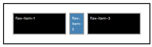
Align-self
- align-self: stretch
- align-self: flex-start
- align-self: flex-end
- align-self: center
- align-self: baseline
The align-self property can be added to a single flex item to change only that items aligned.
Here “align-self: flex-start”, “align-self: flex-end” and “align-self: center” are used to align only the blue box without changing the alignment of the other flex items.
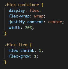
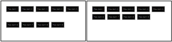
Flex-wrap
- flex-wrap: wrap
- flex-wrap: nowarp
The default value is “flex-wrap: nowrap”
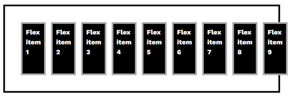
“flex-wrap: nowrap” can result in overflow.
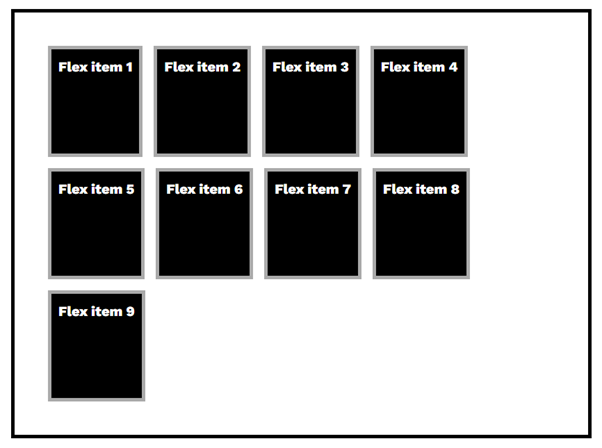
“flex-wrap: wrap” will wrap flex items onto a new line to prevent overflowing.
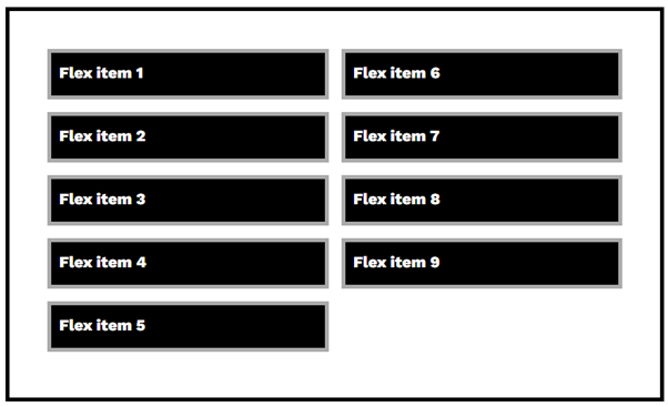
Flex-wrap will also work when using “flex-direction: column”
wrap navbar
Using flex-wrap, justify-content, a width on the parent, and on the flex items both a flex-shrink and flex-grow. You can create a row of flex items that can grow to a maximum size, wrap onto a new line and can shrink down for smaller screen sizes when needed.

Above shows this idea, which is typical for navigations. The screenshot shows what the navbar looks like at various screen sizes.
Adjustable sidebar layout
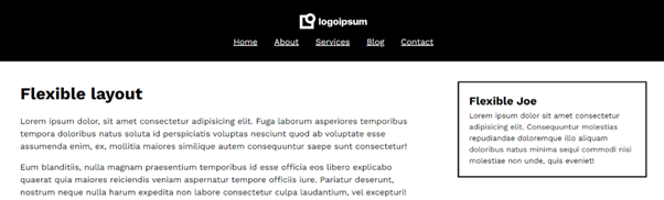
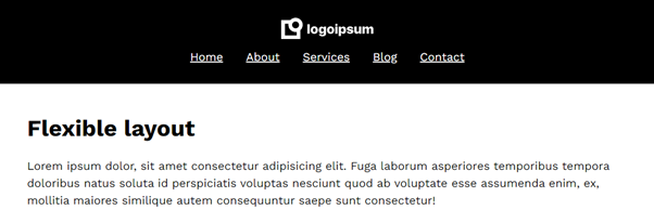
Using a width and “flex-grow: 1”, on the main section with the text, and on the sidebar, you can cause the sidebar to appear next to the main section at large screen sizes, but wrap below the main section on smaller screen sizes.
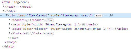
Here you can use “flex-wrap: wrap” is used on the flex container, then a fixed width and flex-grow is used on the flex items, to allow them to be next to each other, at larger screen sizes.
Flex-flow
- flex-flow: row wrap
- flex-flow: row nowrap
- flex-flow: column wrap
- flex-flow: column nowrap
- flex-flow: row
- flex-flow: column
- flex-flow: wrap
- flex-flow: nowrap
You can combine the flex-direction and flex-wrap into a short hand called flex-flow.
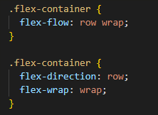
“flex-flow: row wrap” is the same as typing “flex-direction: row” and “flex-wrap: wrap”.
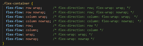
Here are some of the values for flex-flow.
You can omit the first argument e.g. “flex-flow: wrap” which is the same as typing “flex-wrap: wrap”.
You can also omit the second argument and use row/column in flex-flow which is the equivalent of using “flex-direction: row” or “flex-direction: column”.
Align-content
- align-content: center
- align-content: flex-start
- align-content: flex-end
Align-content groups flex items together, then aligns the whole group.
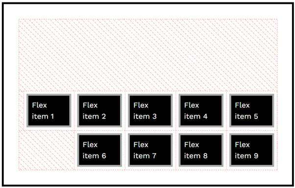
Align-content should only be used when wrapping flex items. If your using “flex-wrap: nowarp” then you should use align-items instead.
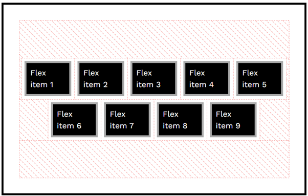
When wrapping flex items “flex-wrap: wrap”, the align-items property can create large spaces between the flex items. As you can see in the screenshot “align-items: flex-start” creates space. To fix this “align-content: flex-start” can be used, align-content groups the flex items together then aligns the full block.
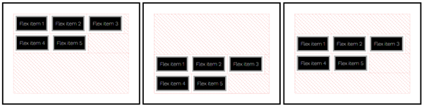
“align-content: flex-start” pushes the wrapped flex items to the top of the flex container.
“align-content: flex-end” pushes the wrapped flex items to the bottom of the flex container.
“align-content: center” pushes wrapped flex items to center of flex container.
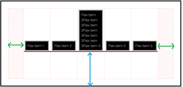
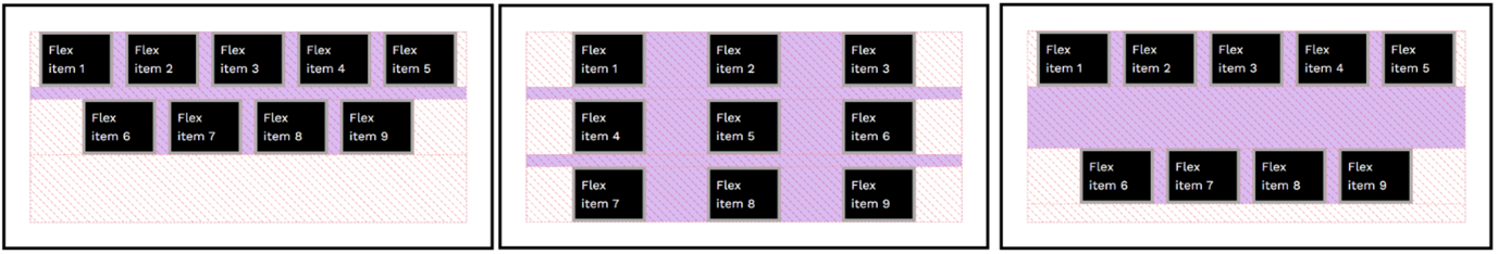
Here “align-content: flex-start” is used to group the flex items together and push them to the top of the container (blue arrow). “justify-content: center” then horizontally centers the group creating spacing on the left and right of the flex container (green arrows). Finally “align-items: flex-end” pushes the flex items to the bottom of the group (as shown by the red line).
Place-content
Place-content is a shorthand for align-content and justify-content. Place-content should only be used with “flex-wrap: wrap”.
Here “place-content: flex-end” is used to place the flex items in the bottom right corner of the flex container. This is the same as typing “justify-content: flex-end” and “align-content: flex-end”.
“place-content: center” is really useful for vertically and horizontally aligning flex items in the center of the flex container.
Gap
The gap property creates space between flex items
“gap: 1em” creates a 1em gap between both rows and columns.
“gap: 1em 5em” creates a 1em gap between rows, and 5em between columns.
“gap: 5em 1em” creates a 5em gap between rows, and 1em between columns.